

SUNDAY STUDY — GIAMPIERO TAGLIAFERRI
On Milanese-Californian cool and the art of layered interiors

Happy Sunday. I don’t know if it’s me, but it feels like it’s been a particularly eventful month for museums recently.
New York’s New Museum reopened to the public with an expansion by OMA, though some have noted parts of the building still feel unfinished. The London EDITION announced a year-long partnership with the Design Museum. LACMA’s new Zumthor-designed extension is now open to the general public. IKEA announced plans for a Museum of Furniture Studies inside a former warehouse, designed by Cobe. And Sotheby’s opened Marcel, a restaurant inside their new home in the iconic Breuer Building on Museum Mile where everything’s for sale. (I’m checking this out in a few weeks.)
The urge to get out and do stuff is feeling very real.
And good timing, because New York Design Week starts Thursday. Stay tuned for a special edition later this week for where we’re headed and what’s worth seeing.
The great defrosting.
Thanks to Drafted for sponsoring this week’s issue. Drafted lets anyone generate and remix home layouts instantly, then export them to PDF or CAD.
This week, we’re looking at a few projects by Giampiero Tagliaferri, whose work reflects his own dual identity: part Milanese modernism, part California informality.
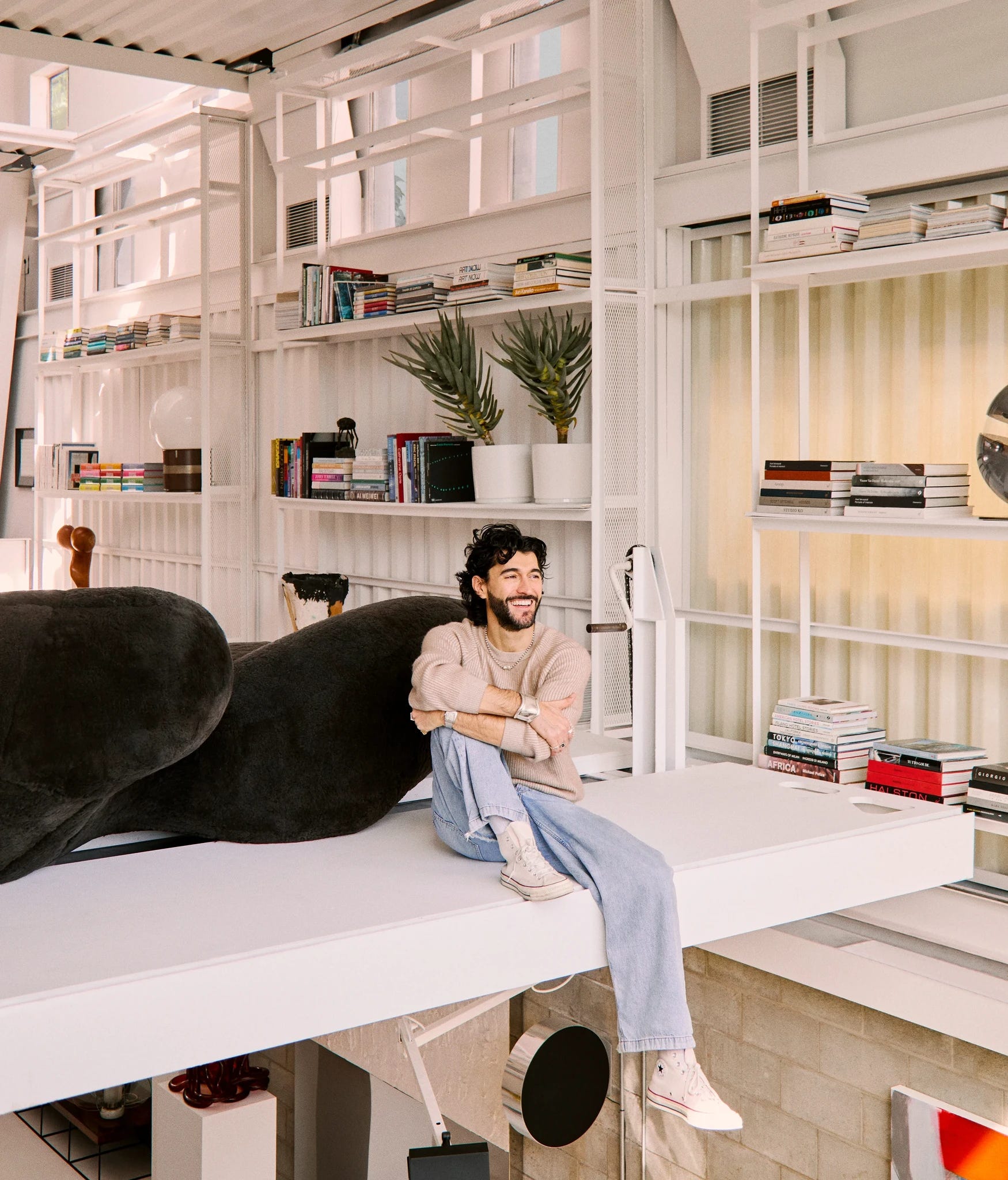
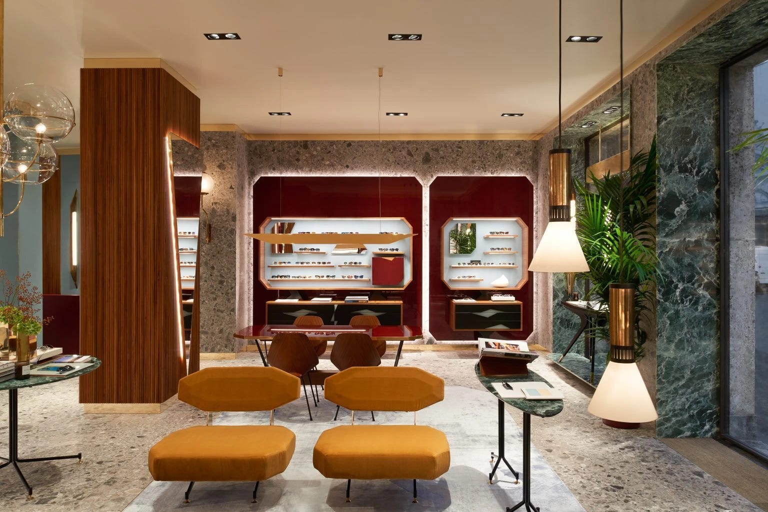
Before launching his own studio, Tagliaferri led brand and retail design at Oliver Peoples, where he helped pioneer a more layered, contextual approach to luxury retail at a time when eyewear stores were converging around a globally similar minimalist aesthetic. His 2015 Milan flagship, designed around the feeling of a 1950s Milanese apartment, shifted the store from a place that sold glasses into a place that projected a world.
That same instinct runs through his interiors today. His projects feel refined, sensual, and deeply personal — spaces shaped through texture, references, local context, and objects collected over time.
In the era of tasteslop and what I’ve called “Algorithmic Modernism,” it’s refreshing to see interiors that not only feel lived in, but individual. No two feel quite the same.
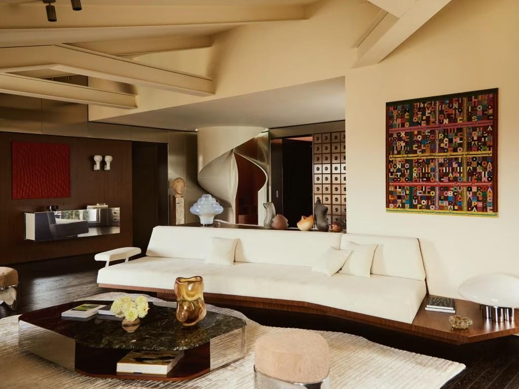
In his work on a Milanese Pied-à-Terre, Tagliaferri filters avant-garde Italian references through the atmosphere of a hotel suite or bachelor pad. The whole space feels quite sculptural, full of sharp lines and dramatic forms that somehow never overpower the room. It’s playful and sensual without losing its sense of ease. I feel like I need a good robe to be here.


Being a Milan-born brand, it makes sense Sant Ambroeus would tap Tagliaferri (also a regular there himself) to design their Aspen location. Faux fur, marble, wood grain, and textured stone all echo one another, giving the space a warmth and tactility that feels distinctly Aspen. The faux fur especially feels like a risky gesture that somehow makes the entire interior warmer and stranger in the best way.
And I’m always drawn to spaces that reinterpret Alpine forms. There’s been a broader return to these kinds of interiors lately too — tactile, wood-heavy, slightly 70s. More Milanese living room transplanted into a ski town than rustic lodge cliché.
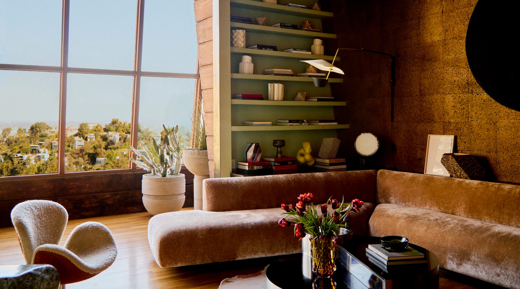
In his redesign of A. Quincy Jones’s 1938 personal residence, Tagliaferri described wanting the house to feel like “a time capsule, but one that was still alive.” There’s something about layering across time that amplifies the architecture rather than overpowering it. The huge window walls, cork surfaces, and slanted geometries somehow feel even stronger because of the interiors around them. You stop reading the house as a collection of periods or styles and start experiencing it as one continuous space.
1 Hotel Austin is now accepting reservations — we just added it to the Linear Concierge collection. We’re currently helping readers plan trips across Japan, Stockholm, Mexico City, Italy, and elsewhere. If you have a trip coming up, send us a note: concierge@linear-magazine.com.